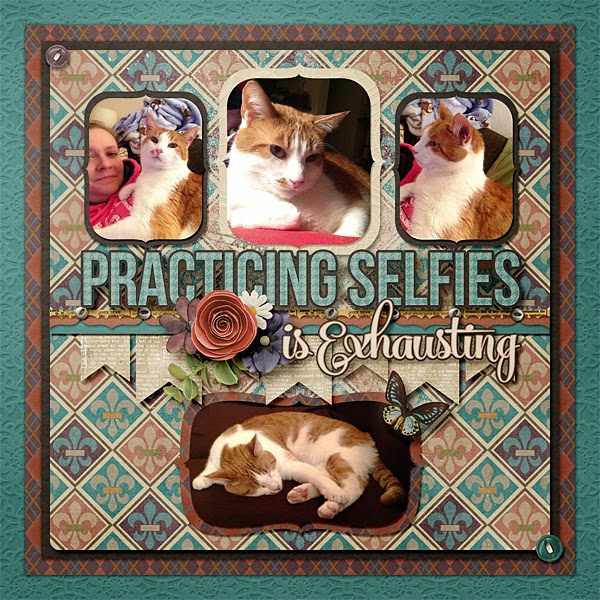
I'm kind of a fan of lots of things tucked here, there, and everywhere.
I'm also a little addicted to "outlining" things. Titles, edges of layouts - doesn't matter. Lets me use more papers, so it can't be a bad thing #LovesPapers
So today I tried doing something new and different. Because I spent some time the last few days looking at recent layouts, and it seems that I am in a rut. So here we go. No outlines. No elements/flowers/strings/labels/butterflies.
Well, ok, the paper is flowered, but that's all. And ok, maybe I outlined the photos and the diagonal. But I rather like the clean look. Will it become my new "thing?" Probably not. As it is I am itching to put another paper around the edge...
How about you? Are you in a scrapping rut? Tried anything new lately? I'd love to hear what you're up to!
In the meantime, I made a template out of the first layout above. You can download it HERE.
Enjoy!


2 comments:
I love the clean & simple lines of the "new" layout -- it looks great! (I'm like you, I think to myself: I should add something here or this photo needs something around it, etc.) Thank you for creating a template out of the first layout -- when I saw how your incorporated the title in your cluster, I thought I'll have to try that -- now you've made it even easier! Thank you!
Thanks for the template! I liked your layout with lots of things tucked in here and there. I'm not good at tucking things, so hoping your template will help :)
Post a Comment