Recently I read an article about one's changing taste in scrapbooking. I have to confess, I was a little frustrated, because I feel like I am just finally finding my "groove" in designing, and the author was discussing how she no longer liked to cluster and preferred tiny prints and simplicity. Which is so not me, LOL. I love lush and rich and textural with shabby grungy goodness. But I have to confess it made me start thinking about those who have slightly different tastes, and it also made me think outside the box. How do I know I don't like tiny prints and clean simple layouts? I really hadn't tried to do much (although the Penelope bundle was close). So I've been putting on my thinking cap and trying to develop additional items to complement my original style.
I like this approach for one really big reason - I love unified pages, but I don't like too much "same-y-ness" within that group. Contrast is a huge design principle, and I loves me some contrast, LOL. But "controlled" contrast... well that's a beautiful thing ;) And the contrast between big sweeping shabby patterns and smaller, cleaner patterns... well, I'm beginning to think that's a beautiful thing, too :) And Menagerie seemed the perfect kit to augment - I've been to the zoo, and you take a lot of pictures! Odds are you've got some of most of the different animals, and then pix of the kids, and maybe pix of the scenery... all the more reason to have more options. So here is the first "minimalist" add-on:
I have packaged the papers and elements separately as well, because everyone has different needs and I want you to be able to pick and choose what works best for your style.
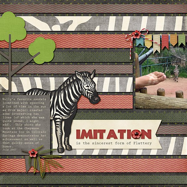
And here are some examples:
My Layouts
Layout by Sondra
Menagerie ... Minimalist is available at the introductory sale price through Friday. And if you are a facebook reader, you might want to check my Sherwood Studio Facebook Page - there's a coupon on there that is still good for a day or so :)
I'd love some feedback, too - what do you think about various styles, and what is YOUR favorite?


1 comment:
Hmm. I find smaller prints more versatile than huge prints, but I enjoy large prints for the splash they make on a page.
Post a Comment